SHANGRALA'S
BRILLIANT
LOGOS!
![]()
Companies get paid hundreds of thousands of dollars to dream up this stuff!
There's hidden meanings in all of these advertising logos. You'll never look
at these logos in the same way again!
Here's Some Of The Best Logos. Enjoy! :)
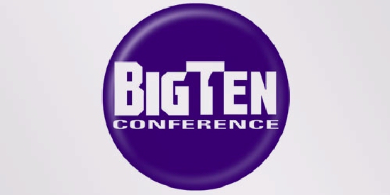
Big Ten:
Until 1990, this union consisted of 10 universities, but in June 1990
Pennsylvania State University was added. They didn't want to change their name,
so they added the number 11 to the logo.

Amazon.com:
First of all, the yellow swoosh looks like a smile:
Amazon.com wants to have the best customer satisfaction.
The swoosh also connects the letters a and z,
meaning that they have everything from a to z.

Eighty-20:
Eighty-20 is a small consulting firm. Most people think that the logo has
nothing to do with the brand name. But the Geek's know to view the dark squares
as 1's and the light squares as 0's. Then the top line reads 1010000 and the
bottom line reads 0010100, which represent 80 and 20 in binary.
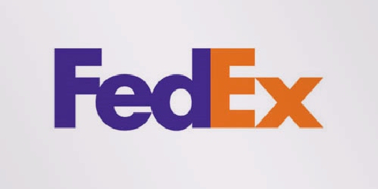
Fedex:
If you look closely, you'll see an arrow that's formed by the letters E and x.
This arrow symbolizes speed and precision, two major selling points of this company.
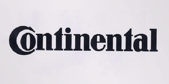
Continental:
Continental is a manufacturer of tyres. You could actually see this in their logo,
because the first two letters create a 3-dimensional tyre.
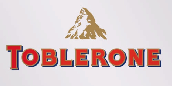
Toblerone:
Toblerone is a chocolate-company from Bern, Switzerland. Bern is sometimes called
'The City Of Bears'. They have incorporated this idea in the Toblerone logo,
because if you look closely, you'll see the silhouette of a dancing bear.
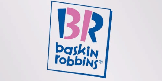
Baskin Robins:
The pink parts of the BR form the number 31, a reference to
31 flavors.
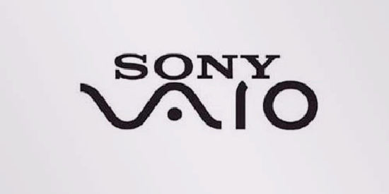
Sony Vaio:
Sony Vaio is a well known brand of laptops. The first two letters represent
the basic analogue signal. The last two letters look like a 1 and 0,
representing the digital signal.
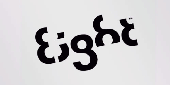
Eight:
Every letter is made from the number 8!
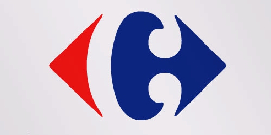
Carrefour:
Carrefour is one of the biggest European retailers, and it's also French for
'crossroads'. The logo symbolizes this word via two opposite arrows. They
also added the first letter of the name, because if you look closely
you'll see the letter C in the negative space between the two arrows.
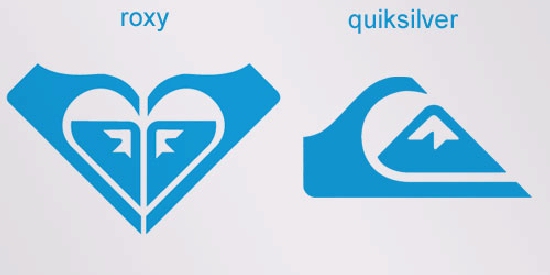
Roxy:
Roxy is a company that specializes in clothing and accessories for girls who
love snowboarding, surfing... The company is actually a part of Quiksilver.
The Roxy logo is made of two Quiksilver logos that form a heart.
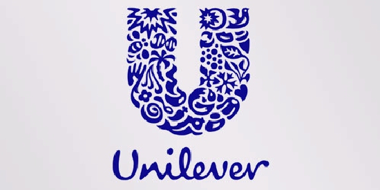
Unilever:
Unilever is one of the biggest producers of food, beverages, cleaning agents
and personal care products. They produce a huge amount of different products
and they wanted to reflect this in their logo. Each part of the logo has a
meaning. For example: the heart represents love, care and health - feeling
good, a bird is a symbol of freedom. Relief from daily chores - getting more
out of life.
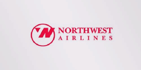
Northwest Airlines:
First of all you can see the letters N and W, the first two letters of
the brand name. But what most people don't see is the compass that
points to the Northwest, another reference to the brand name.
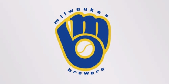
Milwaukee Brewers:
The Milwaukee Brewers is a professional baseball team from Milwaukee, Wisconsin.
Their logo is made up of the letters M (on top) and B (below the m).
These two letters also form a baseball glove.
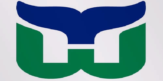
Hartford Whalers:
This logo also uses a negative space to create the letter H. You can see
three different parts: the letter H and W and a whale's tail in blue.
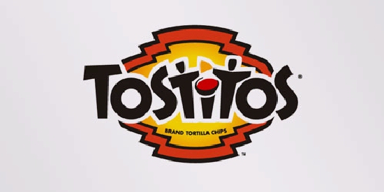
Tostitos:
If you look at the centre of this logo, you can see two people enjoying
a Tostito chip with a bowl of salsa. This logo conveys an idea of people
connecting with each other.
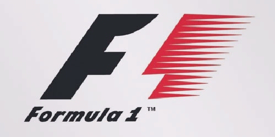
Formula 1:
If you look closely, you'll see the number 1 in the negative space
between the F and the red stripes. It also communicates a feeling of speed.
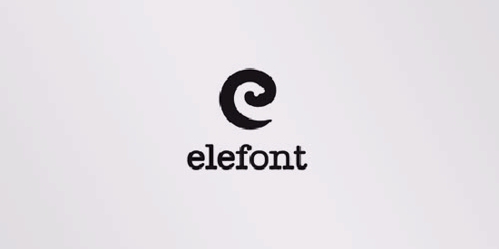
Elefont:
This logo might look like a simple letter, but don't be fooled: you can see a part of an elephant's trunk
in the negative space inside the letter e.
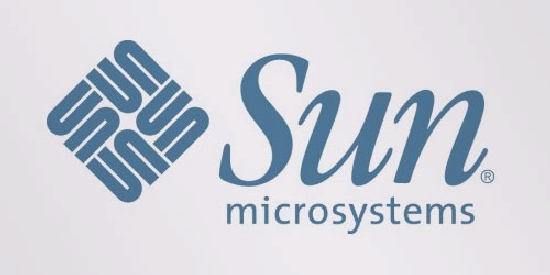
Sun Microsystems:
You can read the brand name in every direction; both horizontally and vertically. This logo was designed by professor Vaughan Pratt of the Stanford University.
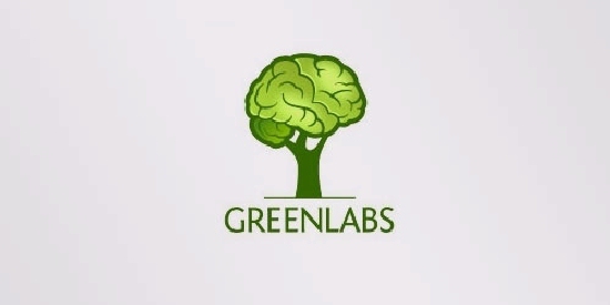
GreenLabs:
If you look at the tree crown, you'll see that it can also be interpreted
as a brain. The logo lays emphasis on the strong intellectual capabilities
of the company's staff and also reflects 'green' and 'labs' parts of their name.
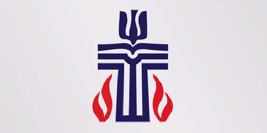
Presbyterian Logo:
If you think the previous logos were a good example of a hidden meaning,
then take a look at this logo. It's the seal of the Presbyterian church and
it has several hidden messages you can check out Here.
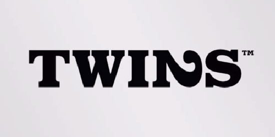
Twins:
This logo was made for twins. To reflect the essence of the duo,
a bold typeface was created to reflect the boldness of their
approaches. The number 2 was integrated to show the creativeness
of their ideas.
Here Are More Brilliant LOGOS:





![]()

Share With Friends :)

![]()
SEE ALSO: Brilliant Ads!

^BACK To TOP^
For those of you who Want More FUN - Visit The Shangy Fun List! Variety is the
spice of life! The Shangy Fun List is an ezine packed full of Poems, Inspirational and
Heart Warming Stories. Jokes from G to slightly R, and Anything else that just
might make you SMILE! Join In The Free FUN!! ... :)
Yes! Click Here To GO TO THE ARCHIVES!-
![]()
![]()
Share This Page!
If you are looking for more, here are some good places to start:
Moses Bridge!-
Chevy Selling It!-
Kilroy Was Here!-
Wall Mural Art 4!-
Witty Comebacks!-
Tour Inside Google!-
Willis (Sears) Tower!-
Truth In Advertising!-
Cool Optical Illusions!-
God's Advertisements!-
Advertising Truck Art!-
Paradox Of Our Times!-
Thoughts Into Action 7!-
Expensive Hotel Rooms!-
Arrows Across America!-
Building Advertising Art!-
Amazing Human Progress!-
World's Spectacular Places 3!-
A-Z Animated Pictures!-


 -To SHANGRALA-
SPECIAL THANKS Goes To GLORIA B. For Sharing This With Us.
![]()
Copyright © 1996 Netscape Communications Corporation. Mozilla is
a trademark of Netscape Communications Corporation.
Note: This is an Unofficial God, Jesus Christ, Family, & Cartoon Fan Site.
© All graphics representing Disney characters are copyrighted by Disney.
Likewise all other graphics & music Copyright © by their own Individual Artists.
I do not own any graphics on this site. If you do, please notify me
and I'll give
you proper credit, a link, or remove it immediately according to your wishes.
~*~ Copyright © 1997-2015 Elrhea M. Bigham ~*~